

Develop a comprehensive plan to improve the McCloskey website’s design and functionality, with a focus on incorporating advanced technical features and enhancing user experience.
During the initial stages of the project, I was involved in the discovery phase where we defined the user interface (UI) for the website. We conducted several meetings to determine the new design and structure of the site. This involved revamping the look and feel of the site to enhance its usability and user experience.
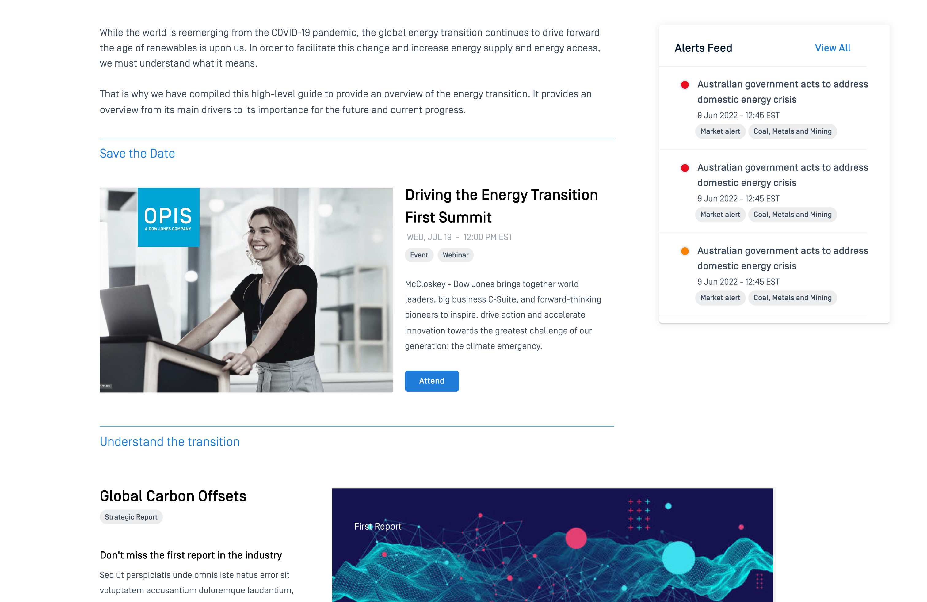
As a visual designer, I was responsible for defining the look, feel, and user experience for the initial phase of our website redesign project. To accomplish this, I drew upon the concepts and information during the discovery workshops with the EPAM and OPIS teams.
To effectively manage a large amount of diverse content, such as articles, news, reports, and summaries, it is crucial to simplify the design while maintaining a balance between cleanliness, sobriety, accessibility, and readability.
In order to redesign the McCloskey site, we conducted a thorough evaluation of similar products and performed a detailed diagnosis of the existing site. Our analysis helped us identify the strengths and weaknesses of the current design and informed our decision-making process for the redesign.
We have documented two boards, one for the previous version of the site and the other to conduct a comparative analysis.
Our research suggests that optimizing search algorithms and avoiding excessive content density on web pages is critical to effective website design. In addition, incorporating white space and adopting a contemporary design aesthetic can improve the visual appeal and usability of websites.


Bring your ideas to life! Please fill out the form or contact me directly—I’d love to hear from you and explore how we can collaborate.


